Friday, 21 January 2011
Thursday, 20 January 2011
Friday, 14 January 2011
Album advert analysis - Oliver Thompson

This music album advertisement includes many typical conventions of music adverts. A typical convention in this is that it includes the band title, it also includes the album title and the name of singles, which consumers may be able to relate to. The advert also includes the typical convention of album artwork as it tries to convey what genre of music the artist is. Another convention is the advert is that incorporates Magazine reviews rating it (NME). Additionally it includes the typical conventions of the website links for it and the sales outlets (HMV).
Conventions of an advert- William Wise
I found a website which gave typical conventions of an advert these are:
- The name of the band/artist
- Title of the album
- Title of hit singles
- Record company
- Release date
- Website link
- Bonus features
- Reviews (NME, Q, Kerrang)
- Outlets (HMV, Amazon)
- Tour dates
- Album art
Friday, 17 December 2010
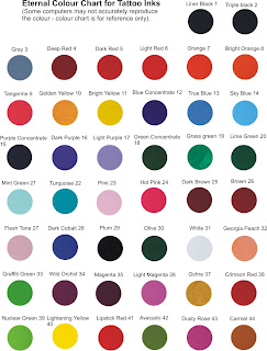
Looking at different colour schemes
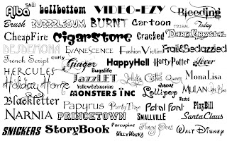
Looking at Different Fonts

Here we see different styles of font used for various products, artists, films etc, they are in all different styles depending on the type of product that they are and therefore we need to used lettering which is more exciting and bold in order to show "the madness" of Madness themselves and of the video, this will create a image of craziness and freedom for the band.
Subscribe to:
Posts (Atom)


