Friday, 17 December 2010
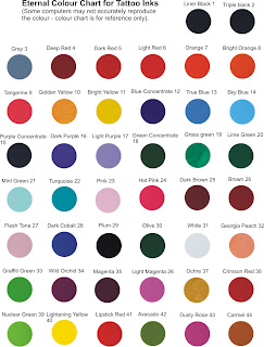
Looking at different colour schemes

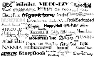
Looking at Different Fonts
Thursday, 16 December 2010
Designing the digipak
Saturday, 11 December 2010
Our Media Project- William Wise
During filming we had our ups and downs. Sometimes there was conflict in deciding what should be done. I decided to be the leader of the group and made the big decisions on what should be done. The group responded positively and so we worked very hard to try and achieve an excellent music video, this involved filming not only weekdays but weekends as well. Mise - en- scene helped us to give the music video a comical approach. We used bright and weird clothing to achieve this. For example a party hat, sunglasses, a purple suit jacket and other vibrant clothes.
For the media project i decided to be the cinematographer. I tried to be creative and professional with the type of camera shots i chose. One of the shots which i felt was creative was the point of view shot through the sunglasses looking at the book, this took a while to achieve the right shot but in the end i think it payed off. I used a variety of camera shots to really emphasise my camera skills and to show that i am capable of achieving this
Friday, 10 December 2010
Student Digipak Analysis - Jack Brown
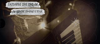
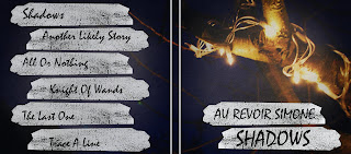
Analysis of the Vixens Digipak- William Wise
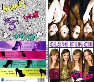
Analysis of a student digipak, Oliver Thompson
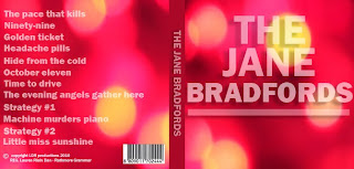

This digipak contains typical digipak conventions. The artist name The Jane Bradfords is included and on the back page there is a shot list. Another convention added was the bar code and copyright information also on the back page. There is the artist name on the spine of the album and another convention used was the lyrics on the inside of the cover. The colour scheme also compliments itself and helps to give idea to what is the genre of the music.
This digipak worked well as the artist title and and other information was clearly shown through the vibrant colour scheme which would help to attract consumers. Also there is effective use of lyrics in the cover. However it does not contain important typical conventions such as Artist imagery is not included.
Editing - Jack Brown
Analysing an example of a student digipak
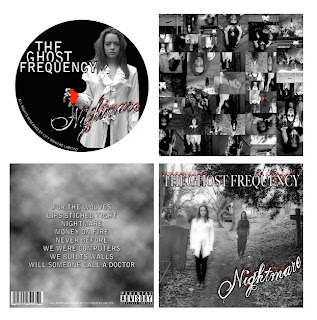
Example of Digipaks
These are examples of other digipaks in a presentation. It shows various digipaks associated with well known artists such as Eminem and his digipak which shows the typical conventions associated in a digipak such as visual imagery of himself. For example he has a picture of his tattoo and various other pictures, this helps the audience to connect with him and to understand more about his personal life. The digipak also shows lyrics of one of his songs and the track list specific to the CD which is also inside the digipak. I managed to the slideshow of digipaks on a website called http://www.slideshare.net/Pieter1933/digipak-research-3344503
Dimensions of a digipak
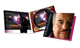

5.53" X 0.25" X 5"
4 Panel Digipak with CD Replicated Inside
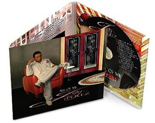

6 Panel Digipak with CD Replicated Inside


Here we see the diffrerent dimensions of a digipak, with examples of how they are in terms actual digipaks. The "4 panel' digipak is the typical digipak used by artists, but the other ones are used sometimes if there is more than one CD or a DVD with the CD.
Oasis Digipak - Jack Brown

I have chosen the digipak by Oasis as my research.
The digipak follows the typical conventions because it has the name of the band and images of the band and artist. The name is also on the spine of the pack. On the pack and on the CD it has track listing as well. The colour scheme follows the type of genre of the band and it also has an image of the instrument used by the band.
The back of the pack also contains website information, band website and record label information. The inside manual has credits and pictures of the band and also contains background information on the band, images and videos of them performing. It also contains bonus acoustic versions of their songs.
The overall design of the digipak is very basic, the colour scheme reflects the style of the music the band plays, and the image of the guitar also displays the genre of music they play. The band name is in a bold white text so the buyer instantly recognizes the band. The text followed by the band name is the shows the type of music within the album, this enables the user to fully know what they are buying.
Digipak analysis, Oliver Thompson
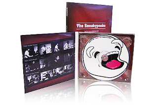
This digipak is an album for the Sneakyspeeks. This digipak follows typical digipak conventions. It contains the artist and album name “face in a crowd”, there are also images of the band performing, introducing each artist with their name and what instrument they play. The spine of the digipak is covered in information and there is artist and bonus information behind the CD. There is imagery on the CD which reflects the genre and fits in with the black and red colour scheme.
Example of a Digipak- William Wise
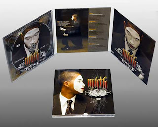
The conventions of this digipak shows the artists dominance in the picture. The digipak shows various pictures of the artist. The digipak shows the tracklist, it also has special designs on the digipak to make it look more professional and presentable. The writing on the digipak is professional and gives the digipak a colourful and vibrant feel to it. The digipak shows the lyrics of one of the songs. The Digipak also had the CD inside for the buyer to listen to.
Analysing a Digipak by Tom Lane
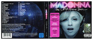
This Digipak of Madonna's "The Confessions tour" album, follows the conventions of the digipak. The digipak features the artist dominantly on the front cover and she is looking at the audience to gain there attention and entice them to buy the CD. The use of colour makes it bright and stand out, with the name of the artist in a bold pink colour. It is made obvious that this CD also contains a DVD by the little sticker on the front of the digipak. On the back with have the track list (all the songs and what number they are on the CD). Whilst in the middle the artists name and CD title are on it making it easy to see what it is if the CD is side-ways.
Using Creative equipment by Tom Lane
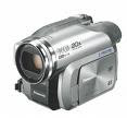
Through the filming task we had to use digital cameras and tripods, Imovie HD and Apple Mac computers. We used the cameras to take a variety of different shots in order to make the music video interesting and got the ammount of shots needed to fill the video and fit in time with the music. The editing on Imovie HD was important as the footage had to be placed in order and then edited so the cuts fit in time with the music.
Thursday, 9 December 2010
Conventions Of A Digipack- William Wise
For the first of our ancillary texts we have decided to construct a digipack. The modern digipack is a variation on the traditional plastic CD case for album, it usually consists of a folding cardboard sheet with a certain number of flaps and storage compartments. The CD either stored on a plastic back or a carboard sleave which is very similar to the classic carboard sleaving for vinyl. Not all of the images included in my research are from digipacks, but represent the way that album art is presented in general.
For a description of some types of digipack see: http://www.mediaheaven.co.uk/digipak.htm (hyperlink option broken)
The digipack (or traditional CD case) is just as important promotional tool for the artist as a music video or any other form of advertising. The artwork needs to be able to stand out from the crowd, while at the same time it has to relate to the music or artist. From looking at a range of album covers and digipacks I have managed to piece together a set of common conventions which are present, these are by no means definitive but seem to represent this form of media text.
•Genre Characteristics
•Artwork reflecting the main themes of the album or artist
•Images of the artist (or their iconography)
•Intertextual references
•A consistent design aesthetic
•Information about the product
There is obviously a great detail of variety in the application of these conventions, this is essential to allow an album to stand out from the crowd. For most texts one convention or a combination of few will provide a unique selling point.
Friday, 3 December 2010
Filming, Oliver Thompson
Our props were that of an adult party with the alcohol, cigarettes, sunglasses and trilby hats. Also i made a small poster for the House of Fun which was shown to the camera in one of the shots so the audience understand the new setting.
Furthermore as a group we uploaded and edited in the new final shots. We had to cut the shits to the beat and get the lip syncing perfectly in time.
Letter to our Record label
The Blue Building, 8-10 Basing Street
London W11 1ET, United Kingdom
Dear Stiff Records
I am writing a letter to you, to ask for the permission to use one of your artist’s songs in our own production, for our A level media coursework. The song is The House of Fun by The Madness. We really appreciate it if we could hear from you soon.
Yours sincerely
William Wise
Mornington Rd
Woodford Green
Essex IG8 0TP
