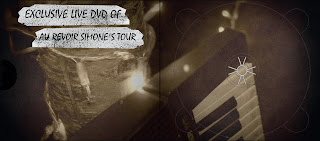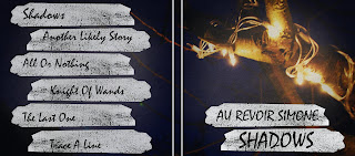

This digipak follows a lot of the typical conventions of a digipak. The artist name and album name is clearly printed on the front cover. The colour scheme and the images used portrays the style of genre the artist is involved in. It has track listings on the back of cover. It doesn't seem to contain any kind of price and images of the band, but it does contain an image from the music video. I't doesn't contain any artist info.
As a whole the album is well designed because it portrays the genre of the artist, the dark colours and sharp dark writing portrays a dark genre. It could of contained more information on the band and images of the band, maybe some reviews from peers. It could of contained lyrics as well. The album design relates to the genre but it could be considered as boring.
No comments:
Post a Comment