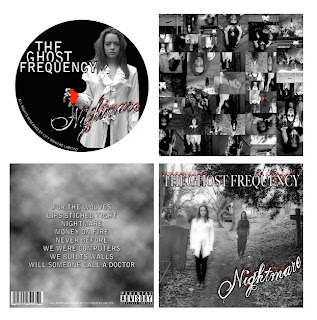
http://getaheadocrmedia.blogspot.com/- I looked at this website and found an example of an A2 Media blog: http://fahminaali.blogspot.com/ I looked at their digipak:

They have gone for a scary and mysterious image on their digipak and of the artist. The artist is featured on the front of the CD and front cover of the digipack, with various images from the music video on the inside cover. There is a track list on the back of the digipak, a barcode and parental advisory sticker (as its too scary for some viewers, possibly). The style is suppose to be "scary", with the band "The Ghost Frequency" and the title 'Nightmare', the smokey dark colours follow this theme and therefore it is successful. The images of a graveyard, and the bright red heart makes it seem dangerous and scary as they intended. It doesn't have lyrics or artist info which may be a fault with the digipak, however not all digipaks have these things and therefore may not be that bad of a problem. It also doesn't have a side bar with the name of artist and song on it, which is typical of a digipak.
No comments:
Post a Comment