Friday, 17 December 2010
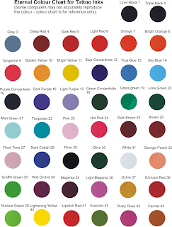
Looking at different colour schemes

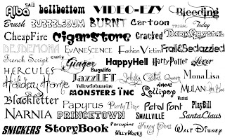
Looking at Different Fonts
Thursday, 16 December 2010
Designing the digipak
Saturday, 11 December 2010
Our Media Project- William Wise
During filming we had our ups and downs. Sometimes there was conflict in deciding what should be done. I decided to be the leader of the group and made the big decisions on what should be done. The group responded positively and so we worked very hard to try and achieve an excellent music video, this involved filming not only weekdays but weekends as well. Mise - en- scene helped us to give the music video a comical approach. We used bright and weird clothing to achieve this. For example a party hat, sunglasses, a purple suit jacket and other vibrant clothes.
For the media project i decided to be the cinematographer. I tried to be creative and professional with the type of camera shots i chose. One of the shots which i felt was creative was the point of view shot through the sunglasses looking at the book, this took a while to achieve the right shot but in the end i think it payed off. I used a variety of camera shots to really emphasise my camera skills and to show that i am capable of achieving this
Friday, 10 December 2010
Student Digipak Analysis - Jack Brown
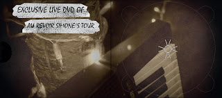
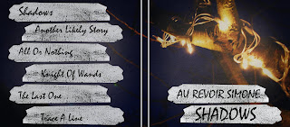
Analysis of the Vixens Digipak- William Wise
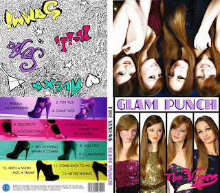
Analysis of a student digipak, Oliver Thompson
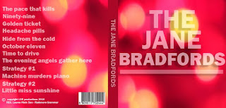

This digipak contains typical digipak conventions. The artist name The Jane Bradfords is included and on the back page there is a shot list. Another convention added was the bar code and copyright information also on the back page. There is the artist name on the spine of the album and another convention used was the lyrics on the inside of the cover. The colour scheme also compliments itself and helps to give idea to what is the genre of the music.
This digipak worked well as the artist title and and other information was clearly shown through the vibrant colour scheme which would help to attract consumers. Also there is effective use of lyrics in the cover. However it does not contain important typical conventions such as Artist imagery is not included.
Editing - Jack Brown
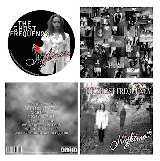
Analysing an example of a student digipak
Example of Digipaks
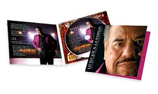
These are examples of other digipaks in a presentation. It shows various digipaks associated with well known artists such as Eminem and his digipak which shows the typical conventions associated in a digipak such as visual imagery of himself. For example he has a picture of his tattoo and various other pictures, this helps the audience to connect with him and to understand more about his personal life. The digipak also shows lyrics of one of his songs and the track list specific to the CD which is also inside the digipak. I managed to the slideshow of digipaks on a website called http://www.slideshare.net/Pieter1933/digipak-research-3344503
Dimensions of a digipak

5.53" X 0.25" X 5"
4 Panel Digipak with CD Replicated Inside
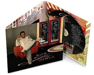

6 Panel Digipak with CD Replicated Inside

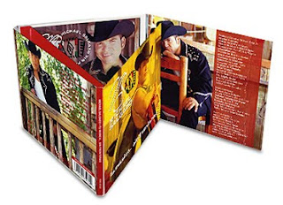
Here we see the diffrerent dimensions of a digipak, with examples of how they are in terms actual digipaks. The "4 panel' digipak is the typical digipak used by artists, but the other ones are used sometimes if there is more than one CD or a DVD with the CD.
Oasis Digipak - Jack Brown
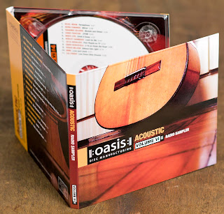
I have chosen the digipak by Oasis as my research.
The digipak follows the typical conventions because it has the name of the band and images of the band and artist. The name is also on the spine of the pack. On the pack and on the CD it has track listing as well. The colour scheme follows the type of genre of the band and it also has an image of the instrument used by the band.
The back of the pack also contains website information, band website and record label information. The inside manual has credits and pictures of the band and also contains background information on the band, images and videos of them performing. It also contains bonus acoustic versions of their songs.
The overall design of the digipak is very basic, the colour scheme reflects the style of the music the band plays, and the image of the guitar also displays the genre of music they play. The band name is in a bold white text so the buyer instantly recognizes the band. The text followed by the band name is the shows the type of music within the album, this enables the user to fully know what they are buying.
Digipak analysis, Oliver Thompson
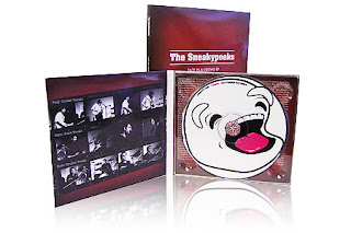
This digipak is an album for the Sneakyspeeks. This digipak follows typical digipak conventions. It contains the artist and album name “face in a crowd”, there are also images of the band performing, introducing each artist with their name and what instrument they play. The spine of the digipak is covered in information and there is artist and bonus information behind the CD. There is imagery on the CD which reflects the genre and fits in with the black and red colour scheme.
Example of a Digipak- William Wise
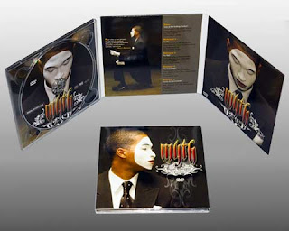
The conventions of this digipak shows the artists dominance in the picture. The digipak shows various pictures of the artist. The digipak shows the tracklist, it also has special designs on the digipak to make it look more professional and presentable. The writing on the digipak is professional and gives the digipak a colourful and vibrant feel to it. The digipak shows the lyrics of one of the songs. The Digipak also had the CD inside for the buyer to listen to.
Analysing a Digipak by Tom Lane
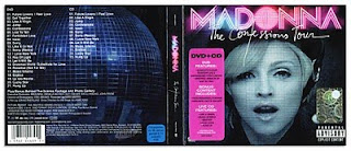
This Digipak of Madonna's "The Confessions tour" album, follows the conventions of the digipak. The digipak features the artist dominantly on the front cover and she is looking at the audience to gain there attention and entice them to buy the CD. The use of colour makes it bright and stand out, with the name of the artist in a bold pink colour. It is made obvious that this CD also contains a DVD by the little sticker on the front of the digipak. On the back with have the track list (all the songs and what number they are on the CD). Whilst in the middle the artists name and CD title are on it making it easy to see what it is if the CD is side-ways.
Using Creative equipment by Tom Lane

Through the filming task we had to use digital cameras and tripods, Imovie HD and Apple Mac computers. We used the cameras to take a variety of different shots in order to make the music video interesting and got the ammount of shots needed to fill the video and fit in time with the music. The editing on Imovie HD was important as the footage had to be placed in order and then edited so the cuts fit in time with the music.
Thursday, 9 December 2010
Conventions Of A Digipack- William Wise
For the first of our ancillary texts we have decided to construct a digipack. The modern digipack is a variation on the traditional plastic CD case for album, it usually consists of a folding cardboard sheet with a certain number of flaps and storage compartments. The CD either stored on a plastic back or a carboard sleave which is very similar to the classic carboard sleaving for vinyl. Not all of the images included in my research are from digipacks, but represent the way that album art is presented in general.
For a description of some types of digipack see: http://www.mediaheaven.co.uk/digipak.htm (hyperlink option broken)
The digipack (or traditional CD case) is just as important promotional tool for the artist as a music video or any other form of advertising. The artwork needs to be able to stand out from the crowd, while at the same time it has to relate to the music or artist. From looking at a range of album covers and digipacks I have managed to piece together a set of common conventions which are present, these are by no means definitive but seem to represent this form of media text.
•Genre Characteristics
•Artwork reflecting the main themes of the album or artist
•Images of the artist (or their iconography)
•Intertextual references
•A consistent design aesthetic
•Information about the product
There is obviously a great detail of variety in the application of these conventions, this is essential to allow an album to stand out from the crowd. For most texts one convention or a combination of few will provide a unique selling point.
Friday, 3 December 2010
Filming, Oliver Thompson
Our props were that of an adult party with the alcohol, cigarettes, sunglasses and trilby hats. Also i made a small poster for the House of Fun which was shown to the camera in one of the shots so the audience understand the new setting.
Furthermore as a group we uploaded and edited in the new final shots. We had to cut the shits to the beat and get the lip syncing perfectly in time.
Letter to our Record label
The Blue Building, 8-10 Basing Street
London W11 1ET, United Kingdom
Dear Stiff Records
I am writing a letter to you, to ask for the permission to use one of your artist’s songs in our own production, for our A level media coursework. The song is The House of Fun by The Madness. We really appreciate it if we could hear from you soon.
Yours sincerely
William Wise
Mornington Rd
Woodford Green
Essex IG8 0TP
Wednesday, 20 October 2010
Friday, 15 October 2010
Lip syncing (Tom Lane)
This song influenced us to take the practice of lip syncing into everyday actions, as out character will also be lip syncing while walking through life.
Friday, 8 October 2010
Madness-One Step Beyond; Other videos that influenced us (Tom Lane)
Screen shot of the walking which we want to use:
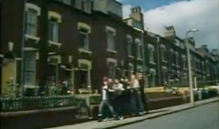
Actual video for Madness-One Step Beyond:
Pitch
In the end we didn't use this idea as it lacked narrative and our feedback was quite negative. The feedback received in our group felt that we lacked creativity and that we didn't plan thoroughly enough, as the music video was based around 4 monkeys running around in different places. We decided to change our music video to House of fun by Madness as we have a better narrative and fits our idea well. The previous song we were going to do didn't have a music video as well, this made it difficult for us to think of a music video, whilst House of fun by Madness had a music video which gave us a couple of ideas o what to do and to help us follow the style they achieved in their music video.
A-Level Media productions from previous years (Tom Lane)
We also looked at a music video for Michael Jackson's PYT from last years Trinity A-level students, and whilst the main character was dressed like Michael Jackson, the female character was dressed in school uniform and they filmed within the schools grounds and therefore looked a bit amateur as she didn't suite the role and the location was poor, this showed us that we need to have correct costume (or appropriate) and location.
We also looked at a music video where the main character was "Elvis" or a person dressed like him and lip synching the words to the song in different locations. This idea May have become boring, but the shot variety in the sequence made it more interesting and the different locations were chosen well. Therefore planning and shot variety are key in making the music video interesting. The lip synching was edited in well and that is also crucial in making the music video look professional.
I looked at an A-level music video for Radiohead's Reckoner, the video is edited well to fit in the with music and the images are chosen well to fit in with the lyrics, quick paced editing at the start fits in well with the quick pace of the song. The video mixes together abstract and storyline in the video and doesn't contain performance. Some of the shots are a bit repetitive, with constant shots of the sky being used. The abstract images go with the song and the video itself is quite well edited. Shot variety is also used to make the video more interesting.
Target Audience
Research into our band
Madness achieved most of their success in the early to mid 1980s. Both Madness and UB40 spent 214 weeks on the UK singles charts over the course of the decade, holding the record for most weeks spent by a group in the 1980s UK singles charts. However, Madness achieved this in a shorter time period (1980–1986).
The album House of fun was released in April 30th 1982. Their label is Stiff Records.
The song was originally recorded under the title "Chemist Facade", without the "Welcome to the House of Fun" chorus. However, while the song was being recorded, head of Stiff Records Dave Robinson demanded that the band add a chorus, to ensure the song was a hit. Upon hearing this, band member Mike Barson immediately wrote the "Welcome to the House of Fun" refrain on his piano.
However, at this point, the song was already recorded, and the management decided not to re-record the whole song. Instead, the recording was edited, and the chorus instruments and vocals dubbed onto the recording. This proved to be difficult, mainly due to technical limitations at the time, and it resulted in the first part of the word "Welcome" being cut off. Due to this, the chorus seemed to begin "Elcome to the House of Fun", so lead singer Suggs was forced to overdub the word "Welcome". Although this proved to be a tough task, it was completed successfully.
Friday, 1 October 2010
Shaggy- It Wasn't Me- William Wise
"It Wasn't Me" is a 2000 number one hit song by reggae artist Shaggy, featuring Ricardo "RikRok" Ducent. It achieved a huge success in many countries, topping the charts in the U.S., France, UK, the Netherlands, Austria, Australia and Ireland.
The video starts out with Rik Rok running to Shaggy's mansion to explain to him what just happened to him. Rik Rok tells him that he cheated on his girlfriend and got caught. Shaggy tells him to tell her that "it wasn't me." The video then cuts into a flashback to earlier that day. Rik Rok had been caught sleeping with another woman, and his girlfriend was outside the apartment in her convertible when two women pull up next to her on their motorcycles. The three women go into the building and Rik Rok sneaks out the window, takes one of the motorcycles and leaves. The women come out and the girlfriend and one of the friends get in the convertible and the other women got on her motorcycle and chase after him. Rik Rok gets on a bridge over the highway when the friend rides on the bridge in front of him. He then hits the brakes to stop while she stops her motorcycle. Rik Rok then hears a noise behind him and it's the other friends and the girlfriend driving the convertible on the other side of the bridge. On the highway below, an 18-wheeler drives by and Shaggy leaves him a text message telling him to look behind him. He notices the truck and jumps off the side of overhead and lands on the truck. He is then dropped off at Shaggy's mansion, showing the same scene from the start of the video.
Analysis Of Queen "Body Language" by Tom Lane
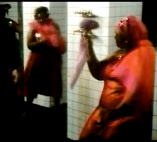
In the video women are objectified, which is typical of music videos in order to entice an audience. this is shown here:
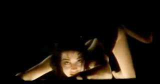
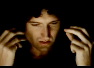
There artist (Queen, they are shown individually and as a group) is heavily featured in the music video with is shown in this image of Brian May:
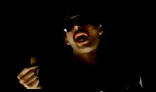
There is lip synching in the music video, which is used to pretend that the artist (or person in the narrative) is singing the song and the audience understands that they are telling the story. This is shown in the image below:
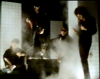
Performance doesn't appear to be used during the music video (instruments not Lip Synching) although the band appear to be performing without instruments in this shot:
The Video also contains some abstract sequences, this is shown in this shot:
Finally the music video is 4:42 which is between the 3-5 minutes that most music videos are:
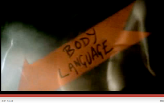
This is the actual music video; Body Language by Queen;
The Scientist By Coldplay - Jack Brown
Critics were positive towards "The Scientist" and complimented the song's piano ballad and falsetto. Several remixes of the track exist, and its riff has been widely sampled. The single's music video won three MTV Music Video Awards, for the video's use of reverse narrative. The song was also featured on the band's 2003 live album Live 2003.
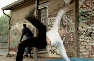
The song heavily uses reverse editing, and from the video our group have gained a lot of influences. The song also has a lot of lip syncing, and it can be considered as abstract.
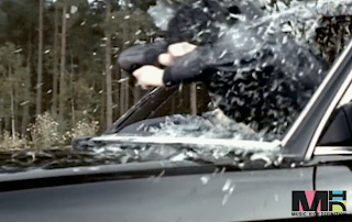
The song's use of reverse editing is extremely clever and it shows a story, instead of the accident being at the beginning and showing his feelings it shows us him after a considerable amount of time.
Eminem-Sing for the Moment- William Wise

"Sing for the Moment" is a hip hop song by American rapper Eminem from the album The Eminem Show, released in 2002. It was released as a music single in 2003. Sing for the Moment" deals with the themes of rap music's effect on society and the misunderstanding Eminem claims critics and parents have towards his message. Eminem uses the song to refute critics who have accused him of promoting violence to young people, saying that committing a crime is ultimately up to the offender. He also explains that his music has an advantage to young people, claiming that his music is a relief from boredom and depression. The song reached #14 on the U.S. Billboard Hot 100 Singles Chart, #6 on the UK Singles Chart, and #5 on the Australian ARIAnet Singles Chart.
A music video for "Sing for the Moment" was made and released in 2003. It consists of a collage created with various clips, including shots from the Anger Management Tour. It also contains cameos appearances by various fellow rappers, including Dr. Dre, D12, 50 Cent and Ludacris. The video is very similar to the 50 Cent music video "If I Can't".
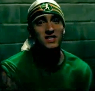
Sing for the moment consists of lip synching and live performance. The video also features the artist throughout the music video. It also features the audience in one of Eminems live performance. The video follows typical conventions as lip synching is used, live performance and a small narrative. There are various shots which shows woman being objectified as well.
Analysis of "That Tree"
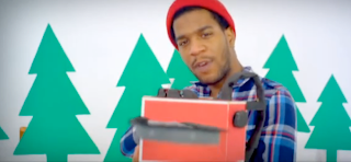
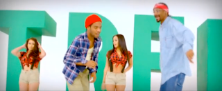
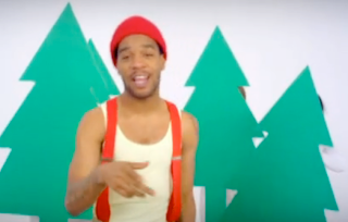
"That Tree" is produced by the artist Snoop Dogg Featuring Kid Cudi. The song was released in December 8th 2009 and is off his album Malice in Wonderland. The Genre of this song is hip hop. The music video includes typical conventions of a music video such as lip syncing, performance,narrative, is cut to the beat of the music which is a moderate pace and the artists are heavily featured as the center of the music video."That Tree" Contains typical convetions of a hip hop music video such as it objectifies women. this represents a specific life style they want people to see they live. The music videos length is 4 minutes 34 seconds, which is not a typical thing for a music video its slightly longer tan the average 2 to 3 minute video.
This screen grab below shows the typical convention of women being objectified.
This screen shot below shows the music video convention of lip syncing and performance.
Plan
(2) Goes through cards and presents and notices a secret party invite in one of them inviting him to the house of fun.
(3) Gets ready for party, he starts to reach for clothes, and he is dressing younger for his actual age.
(4) Journey to the party and during the trip he is gradually maturing, people are beginning to follow him
(5) Gets served in the shop i.e. cigarettes, beer and condom and he walks towards the house
(6) Party is at his own house and when he turns up he is older than everyone.
• Starts with a close up of a hand pressing the play button on an oldish stereo.
• Long shot party room being empty with only the main character on his own =(
• Medium shots of scenery i.e. cake and party hats.
• Medium view of all presents
• Point of view of opening presents (small gifts like socks)
• Medium view or pile of cards and a one card stands out more then the others (bright colour)
• Point of view close up of an invite to a party
• Close up shots of him reaching for clothes (hands only)
• Pan shot of him starting from the bottom and going to the top
• Leaves his house and close up of his door number
• Medium close up shots of clothes flying up on him (individual shots of the clothes flying on)(reverse editing)
• Point of view of people following him
• More shots of the reverse editing
• Medium shot of only his clothes maturing
• Close up of hands reaching for different items
• Point of view of the main character handing over the money
• High status shot of him walking out the door
• More reverse editing showing him maturing even further
• Pan shot of him walk towards door
• Close up of the door number of his own house
• Low status shot of him walking through the door
• Quick cross cutting between the main character and the young children playing
Reverse Editing - Jack Brown
This is what we want to do for our music video. This can happen by using reverse editing, this will be important for our music video as it will look good and it also shows the importance of time going by.
Thursday, 30 September 2010
The Madness-"House of Fun" lyrics
Good morning miss
Can I help you son?
Sixteen today
And up for fun
I'm a big boy now
Or so they say
So if you'll serve
I'll be on my way
we see that there is no one at the party, he is upset and we see everything around him is too young (Jelly, Ice Cream etc)
Box of balloons
With the feather-light touch
Pack of party-poppers
That pop in the night
A toothbrush and hairspray
Plastic grin
Miss Clay on all corners
Has just walked in
He goes to open his presents and we see that they are childish and young, he opens his cards and gets an invite to the "house of fun".
Welcome to the House of Fun
Now I've come of age
Welcome to the House of Fun
Welcome to the lion's den
Temptation's on his way
Welcome to the House of
He leaves the party and starts the journey to the "House of fun", walking down the street with clothes coming on him maturing him.
N-n-n-n-n-n-no no miss
You misunderstood
Sixteen big boy
Full pint in my manhood
I'm up to date
And the date's today
So if you'll serve
I'll be on my way
He goes to the shop and buys alcohol and cigarettes and is joined by more people.
Welcome to the House of Fun
Now I've come of age
Welcome to the lion's den
Temptation's on his way
Welcome to the House of (Fun)
They walk down the road performing and miming the song
I'm sorry son
But we don't stock
Party gimmicks
In this shop
Try the House of Fun
It's quicker if you run
This is a chemist's
Not a joke shop!
Looks at the invite and discovers it is at his own house then changes direction
Party hats
Simple enough clear
Comprehende savvy understand
Do you hear?
A pack of party hats
With the coloured tips
Too late!
Gorgon heard gossip
Well hello Joe, hello Miss Clay
Many happy returns from the day
A more mature boy and his friends arrive at the party finally.
Welcome to the House of Fun
Now I've come of age
Welcome to the House of Fun
Welcome to the lion's den
Temptation's on his way
Welcome to the House of Fun
Welcome to the House of Fun...
He Arrives to find he is the most mature one there, whilst those at the party are young and immature, he enjoys himself at the party.
(Fade to End)
Wednesday, 29 September 2010
Pitch: Our Idea (basic summary, Tom Lane)
He has childish things at the party and he realises they are too young for him. he opens his cards and receives an invitation/leaflet to a secret party; "The House of Fun". He goes and buys cigarettes and alcohol, wearing young clothes and during the journey he matures.
Wednesday, 22 September 2010
Pitch-Song choice and Artist Background
Genre/Style: Ska/Pop
Band Members:
Graham "Suggs" McPherson
Mike Barson
Lee Thompson
Chris Foreman
Mark Bedford
Daniel Woodgate
Carl Smyth
Record labels: Stiff, Virgin, Lucky 7 Records
Years together: 1976–present (on and off)
Song Released in 1982 and was their only number 1 UK hit.
We decided to change our idea from The Monkees (see below), as we felt that our idea was not specific, would cost a lot and the performance side of it would be too hard whilst wearing the suits. And whilst the song fitted in with the Monkey suit idea, we decided to do "House Of Fun" instead without the Monkey suits and with the idea stated above.
Original Idea
Song/ Artist- Hey Hey, We're the monkees (theme from the monkees) By The Monkees
Target Audience- Teenage girls
genre/Style-Bubblegum Pop (which was targeted at a teenage girl audience between 1967-77)
Our idea was to go around in Monkey suites doing different things and creating a narrative through the lyrics of the song, as well as incorporating performance.
Friday, 17 September 2010
Production Tips (Tom Lane)
-The editing has to fit in time with the music, to make it flow
-Use settings which are relevant
-Use costume which is relevant (and not school uniform or a school unless required)
-Use the song lyrics to help create a story if that is the objective for your video
-Make sure the story makes sense.
-Cast Appropriately. Don't have unrealistic characters.
-Fast/slow paced editing to fit with the song
-Choose a song which allows an interesting video to be made
Thursday, 16 September 2010
The History Of The Music Video- Jack Brown
In 1965, The Beatles began making promotional clips for distribution and broadcast in other countries.
The location clips are considerably more elaborate and use vibrant colour footage shot on location in the grounds of Chiswick House, London. Both clips are notable for their use of hand-held camera work, rhythmic editing, slow motion shots and reversed film. Most notably, apart from a few brief shots the Rain clip virtually abandons any pretense of performance and has no obvious narrative structure.
The Rolling Stones appeared in many promotional clips for their songs in the 1960s. One of the earliest, dating from 1964, showed the band on a beach, miming to their single Not Fade Away, but this has apparently since been lost. In 1966, Peter Whitehead directed two promo clips for their single Have You Seen Your Mother, Baby, and Standing in the Shadow?
Many countries with local pop music industries soon copied the trend towards promo film clips. In Australia, promotional films by Australian pop performers were being made on a regular basis by 1966; in 1968 singer Lynne Randell featured in one of the first promotional clips for an Australian act that was filmed in colour, but most Australian clips from this period were in black and white, because Australia did not convert to colour TV until early 1975.
During late 1972–73 David Bowie featured in a series of promotional films directed by pop photographer Mick Rock, who worked extensively with Bowie in this period. These clips are important landmarks in the development of the music video genre in the 1970s, and they are also notable because they were made by a professional photographer rather than an established film or TV director, and because Rock was given total creative control over the clips.
The Australian TV shows Countdown which premiered in 1974, were significant in developing and popularizing the music video genre in Australia and other countries, and in establishing the importance of music video clips as a means of promoting both emerging acts and new releases by established acts.
Conventions of A music video (Tom Lane)
Lip synching and live performance are often used in music videos, this usually features the artist but sometimes contains members of the public (such as Rockstar by NickelBack), Live performance is shown in this video by The White Stripes, which shows them playing instruments:
Music videos sometimes have a story line (or plot) to them, the plot often relates to the music video and The artist is heavily featured, this promotes the artist and makes the artist the centre of attention, these are both shown in this video:
Women are sometimes "objectified" in music videos, this makes them more attractive and objects of desire to male audiences, this is shown in this video:
The video is cut to the music as in this video, so it is in time with the song and therefore fits in well, this is shown in this video:
Wednesday, 15 September 2010
The history of the music video- William Wise
Premiering in 1974, the Australian TV show 'Countdown' played an important role in the development of the music video industry. Music video clips were used as a method of promoting acts that were to appear on the show. As the popularity of the video clips grew, the music industry began to realize the marketing potential of these music clips. One of the most notable video clips features was the AC/DC hit, "It's A Long Way to the Top." During the 1980s, 'Countdown' aired in 22 countries.
In 1981, the U.S. video channel MTV was launched and it began the age of 24-hour music television. They launched the channel with the video, "Video Killed the Radio Star." Throughout the 1980s, MTV expanded to become an important tool used in music marketing. Singers like Madonna not only used music videos to promote their albums, but to create their images. In 1983, the almost 14-minute-long video for Michael Jackson's song "Gay," was released. It became the world's most successful and influential video in music video history.
In 1988, the MTV show, Yo! MTV Raps was launched. The show helped to bring hip hop music to a nation wide audience. Two of the videos that are most famous for being two of the three most expensive music videos of all time are Michael and Janet Jackson's "Scream," which cost $7 million to produce, and Madonna's "Bedtime Story," which cost $5 million. "Scream" is still the most expensive video ever made.
Evaluation of Alice Cooper- No more Mr. Nice Guy
Thursday, 22 July 2010
Evaluation Questions For Prelim Task - Jack Brown
The song we were given was No More Mr. Nice Guy By Alice Cooper, and we had to make a music video for the song, we were allowed to cut out some of the song if we wished to.
How Have You Used Digital Technology In The Construction Of Your Video?
Digital technology had a huge input towards our media product, we were given a hand held camera with a stand to record the music video. Then we had access to Apple Macs, and an editing software called iMovieHD. We was also enabled to show our video to the public via YouTube.
Discuss The Planning Stage Of Your Production And The Steps You Went Through.
To plan the media product we made a list of all the various shots and we made a rough storyboard as an visual aid to help us contruct the shots. Whilst some of our group was creating the storyboard the half started taking notes from music videos by the same music artist of the same genre, this helped us understand the generic conventions for the genre Rock in a music video.
How Did Your Research Into Music Videos Contribute To The Development Of Your Own Production?
We looked at what other media groups from previous years did that had the same genre as us and from that we were able to copy what they did and see what worked well, we also look at general rock music videos to see how the editor has enabled the video to flow with the tempo of the music video.
What Do You Think Are The Main Strengths/Weaknesses In Your Production? (Consider The Audience Feedback)
I think the main strength is that at the beginning the sequence flowed really well with the music and the tempo. There was a good structure and alot of contuinity editing throughout the piece. Near the end of the sequence the video began to colapse and we got lazy, we didn't have enough shots so we added a few random shots to fill the time. The plot of the sequence was very good according to the audience feedback, altough near the end the quoting back from my previous comment, we got lazy and the acting was getting drowzy. The worst part of the sequence was the lip synching, we have now learnt that singing into a webcam was a horrible idea and we have now learnt from the mistakes.
